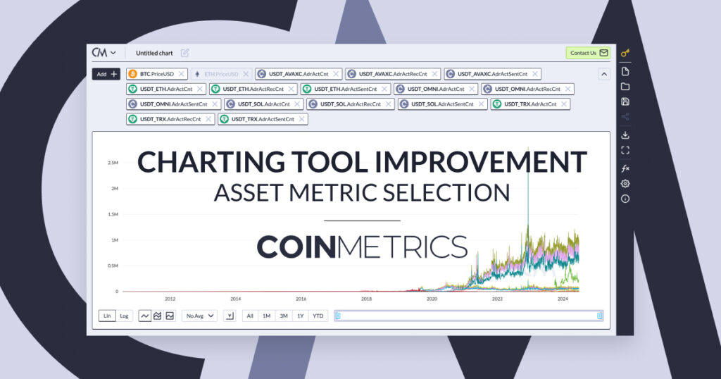
New Workflow for Selecting Asset Metric Combinations
With the constantly evolving and expanding crypto asset landscape, Coin Metrics continues to expand its coverage to new networks and assets, adding custom metrics for certain assets in the coverage universe while supporting the largest amount of metrics from the existing metric universe. Due to the unique nature of crypto assets, in many cases a metric that is available for asset a might not be available for asset b and vice versa. In order to ensure a smooth user experience and eliminate guesswork and errors, Coin Metrics is excited to launch a new workflow on the existing charting tool to select asset metric combinations. All existing charts, dashboards, formulas and correlation charts will continue to work without any changes needed by the user to support the new workflow.
The New Workflow
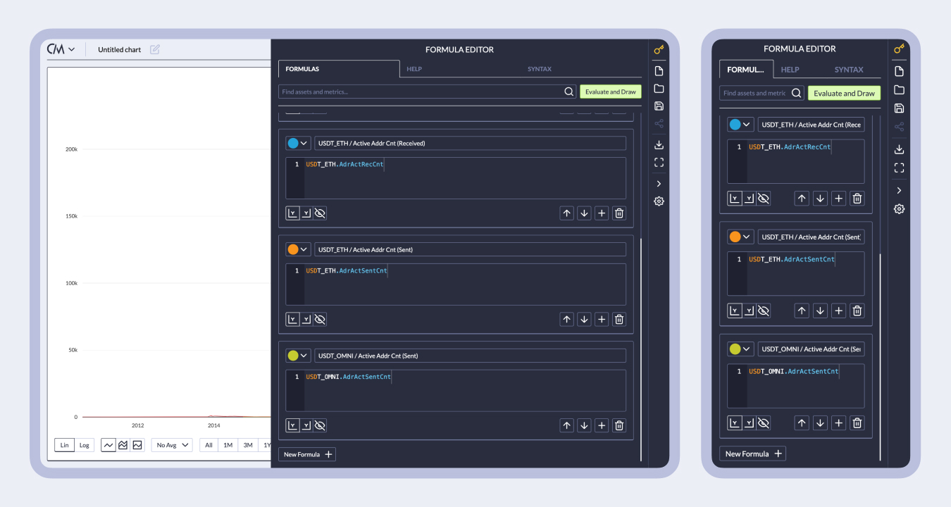
In the new workflow, instead of selecting a unique set of assets and metrics and trying to plot all combinations, users now select distinct asset-metric combinations. This allows users the flexibility to plot any supported combination of assets and metrics while eliminating errors when a combination wasn’t available.
New view of selected asset-metric combinations. Each plotted timeseries is a combination of an asset paired with the metric
To make the workflow as smooth as possible, users can select multiple assets at once before moving on to the selecting the corresponding metrics (or vice versa) with the second step automatically showing a filtered list of metrics/assets and only allowing those to be selected that are supported by all previously selected items.
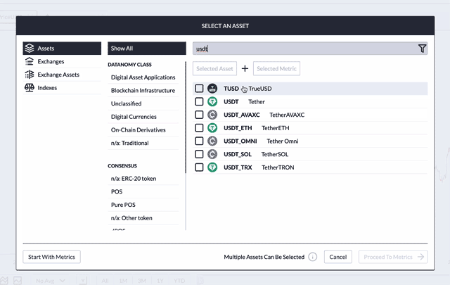
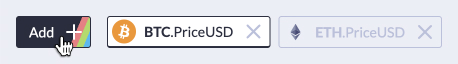
View of searching for and selecting multiple assets
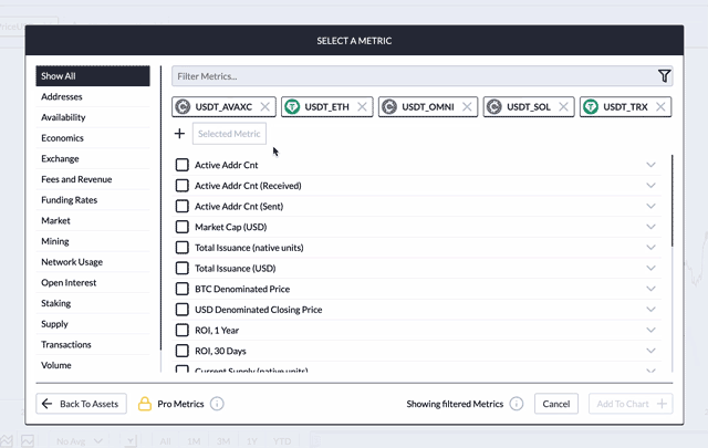
View of pre-filtered list of supported metrics based on selected assets
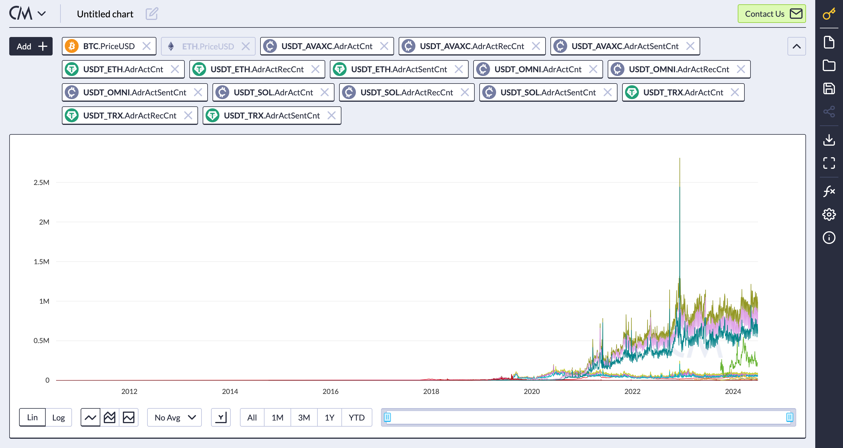
Chart plotting the above selected asset-metric combinations – additional selections are hidden and can be shown by clicking on the down arrow next to the top row
Other Changes
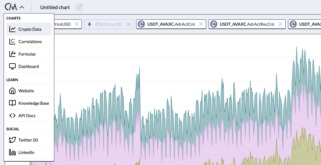
The menu to switch between different chart types and other helpful links has moved to the top left.
Charts are now fully responsive, providing a seamless experience on both mobile and tablet devices.
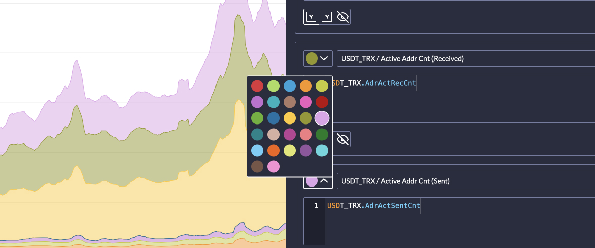
Updated color palette for charts.
Check out the changes at charts.coinmetrics.io
To learn about our charting tool, please visit our data encyclopedia at:
https://docs.coinmetrics.io/data-visualization/charting-tool
How can you stay updated?
At Coin Metrics we are constantly innovating and releasing new data and insights. In addition to Email and Slack, you can keep updated through the following channels: