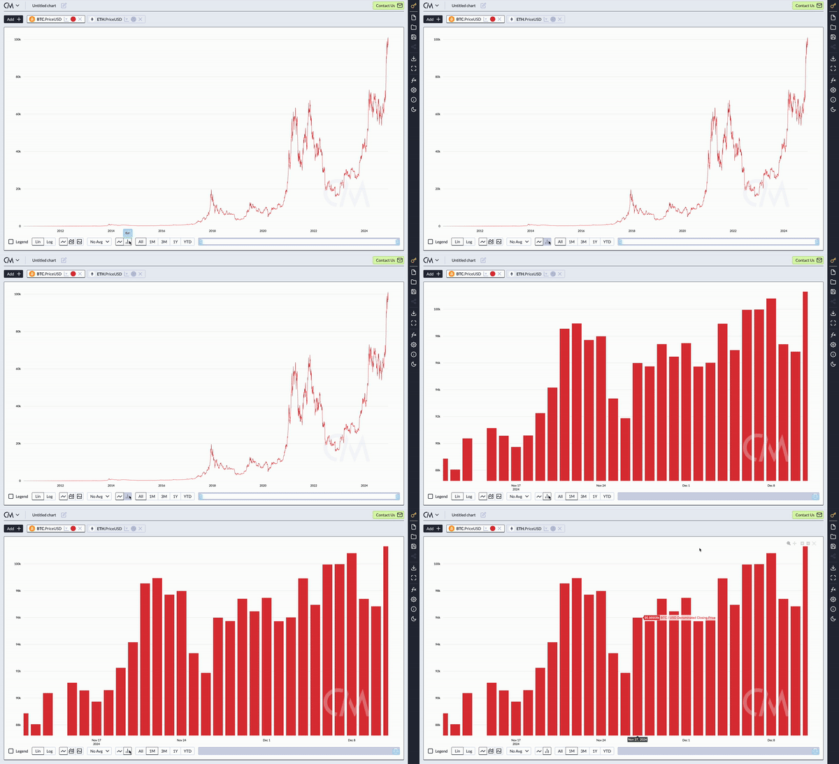
In the ever-evolving crypto asset landscape, Coin Metrics is committed to empowering its customers with cutting-edge tools to generate industry-leading insights. To further enhance our Charting Tool, we are excited to announce the introduction of bar chart support for plotting timeseries data.
Key Features: Plotting with Bar Charts
With this new feature, you can now plot any timeseries data as a bar chart directly within the Charting Tool interface. Whether you’re creating a new chart or modifying an existing one, switching to a bar chart is as simple as a click. Here’s how it works:
- Select Asset-Metric Combinations: Choose the metrics and assets you want to visualize, just as you always have.
- Switch Chart Types: Toggle between a line chart and a bar chart with a single click to display your data in the format that best suits your analysis.

Example: Switching a Line Chart to a Bar Chart
Effortlessly switch between chart types to customize your visualization.
Enhanced Visualization Options
To maximize flexibility in presenting Coin Metrics data, the new bar chart feature includes the following capabilities:
Dual Y-Axis Support: Combine bar charts with line charts by assigning data to a secondary y-axis for clearer comparative analysis.
Example: Plotting a stacked bar chart alongside a line chart on a secondary y-axis.

Grouped, Stacked, and 100% Stacked Bar Charts: Customize your bar chart to suit your needs, whether comparing grouped data, visualizing cumulative metrics, or displaying relative proportions with 100% stacking.

Select between grouped, stacked and 100% stacked bar chart options
Formula Builder Compatibility: Bar charts seamlessly integrate with the formula builder, allowing you to write custom formulas and visualize the results in a bar chart format, alongside other chart types like lines.
Example: Combine a bar chart and line chart in the formula builder for enriched analysis.

Dashboard Integration
The new bar chart functionality integrates fully with the dashboard tool, enabling you to:
- Add bar charts alongside other chart types for comprehensive views.
- Easily highlight trends and insights across multiple metrics in a single dashboard.
Example: Adding a bar chart of BTC’s price to your existing dashboard app.

Adding a Bar chart of BTC’s price to the dashboard app
Additional Enhancements
Legend Display: Easily display a legend beneath the chart in Crypto Data Charts for improved readability and presentation.

With the addition of bar chart support, Coin Metrics continues to prioritize flexibility, usability, and advanced visualization tools for our customers. Start leveraging these new capabilities today to unlock deeper insights and enhance your workflows.
Details:
To learn about our charting tool, please visit our data encyclopedia at:
https://docs.coinmetrics.io/data-visualization/charting-tool
How can you stay updated?
At Coin Metrics we are constantly innovating and releasing new data and insights. In addition to Email and Slack, you can keep updated through the following channels:


